In the world of presentation design, one of the most frequent questions I encounter is about the choice between dark and light themes. Each has its merits, its drawbacks, and its particular areas of strength. Let’s dive in and explore these two commonly used themes.
Dark Themes
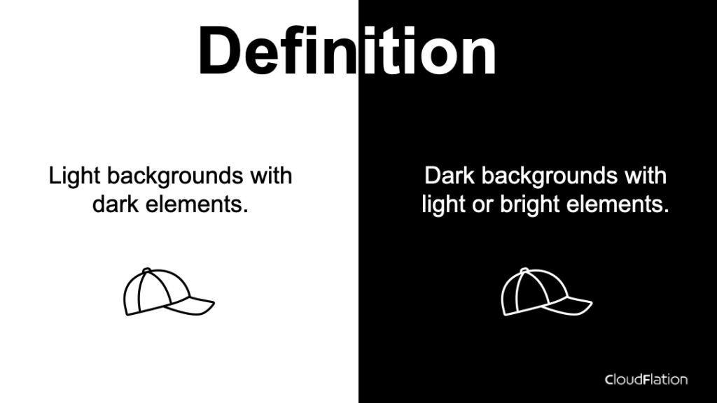
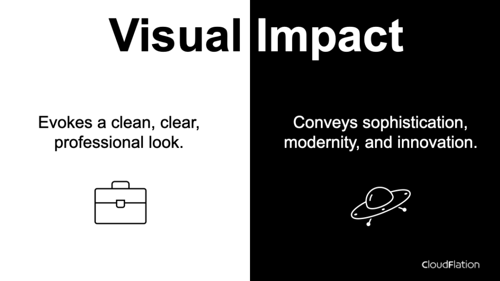
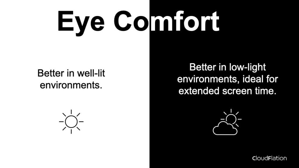
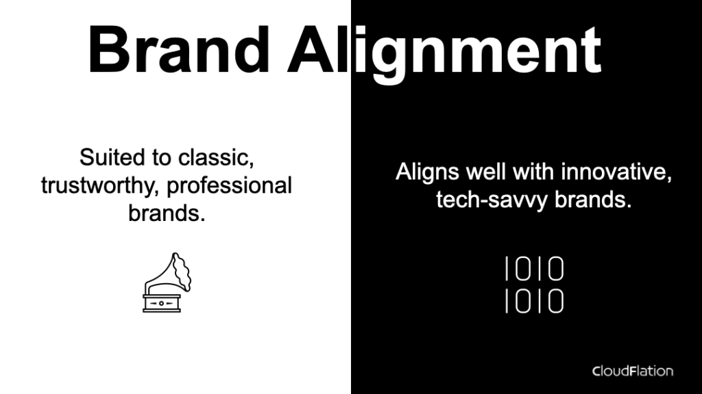
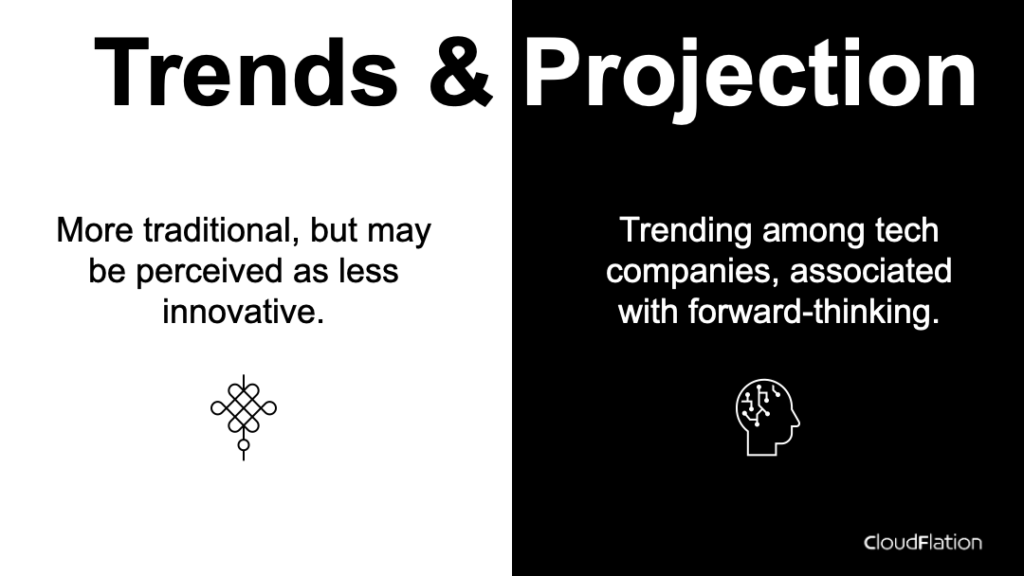
Dark themes use shades of black or dark colors as the background, contrasted by light or bright text and elements. This theme is often associated with sophistication, modernity, and creativity. It’s particularly beneficial in low-light environments, reducing eye strain and giving a cinematic feel to your presentation. However, it can be harder to read in well-lit environments, and not all color schemes work well with a dark background.
Light Themes
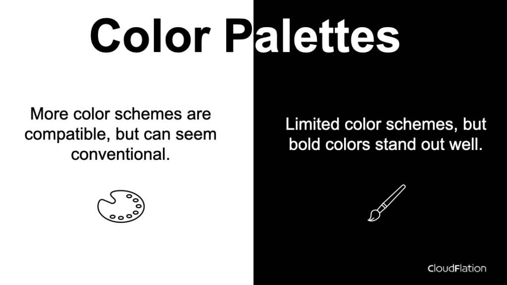
On the other hand, light themes typically use white or light colors as the background, contrasted by darker elements. These themes convey a sense of clarity, cleanliness, and professionalism. They are easier to read in well-lit environments, and a wide range of color schemes are compatible with a light background. However, they can cause eye strain in low-light settings and may be perceived as less exciting or innovative than dark themes.
Comparing Dark and Light Themes
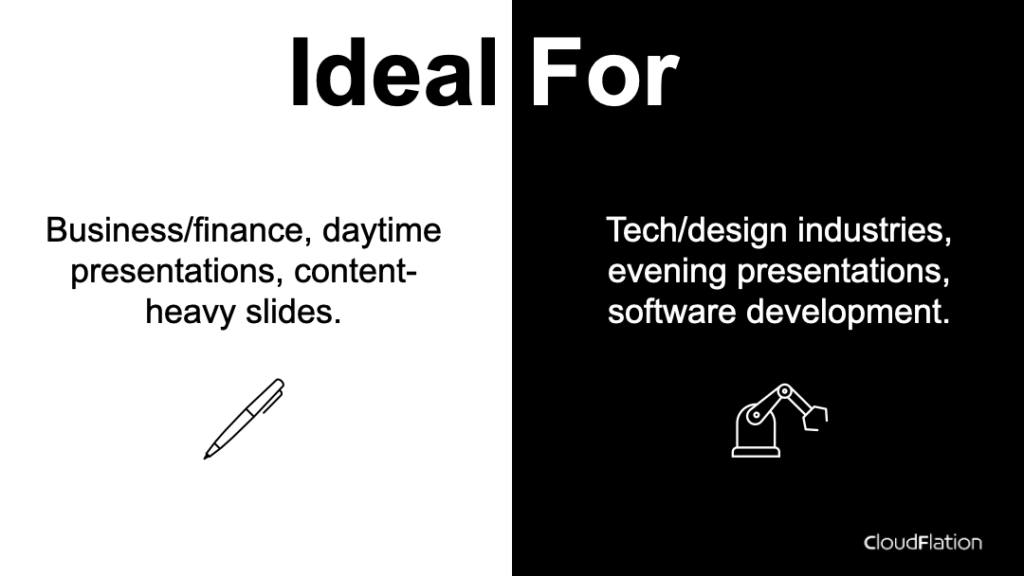
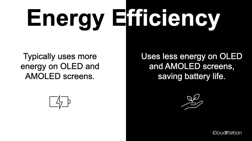
To illustrate the differences and considerations between these two themes, I’ve created a comparison infographics. It highlights several aspects, including visual impact, eye comfort, color compatibility, brand alignment, and implications for tech companies.